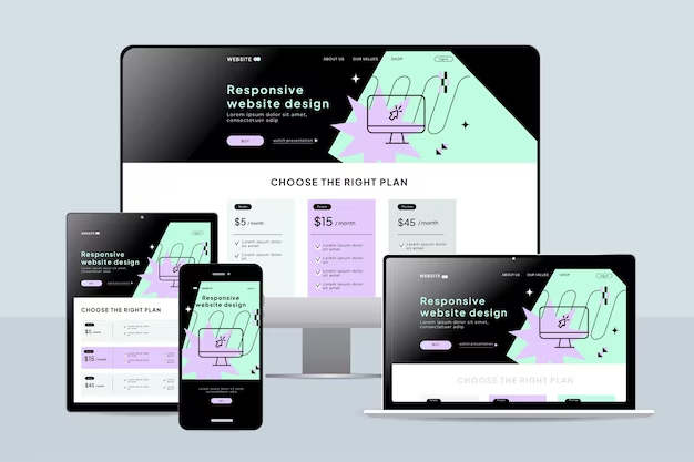
Mobile Responsive Website
20 techniques for developing a mobile-responsive website using HTML, CSS, and JavaScript:
Responsive Design Frameworks: Utilize frameworks like Bootstrap, Foundation, or Bulma that provide pre-built responsive grid systems and components.
Viewport Meta Tag: Set the viewport meta tag
<meta name="viewport" content="width=device-width, initial-scale=1">to ensure the website adapts to the device's screen width.Media Queries: Use CSS media queries to apply different styles based on the screen size, such as
@media (max-width: 768px) { ... }for smaller screens.Fluid Layouts: Design layouts using percentage-based widths rather than fixed pixels to allow content to adapt to different screen sizes.
Flexible Images: Use CSS
max-width: 100%;to ensure images scale down proportionally on smaller screens.Mobile-First Approach: Start designing for mobile screens and then add styles for larger screens using media queries. This ensures a better experience on smaller devices.
Flexbox and CSS Grid: Utilize Flexbox and CSS Grid layout techniques to create flexible and grid-based designs that adapt well to various screen sizes.
Responsive Typography: Use relative units like
em,rem, or percentages for font sizes to ensure text scales appropriately on different devices.

Touch-friendly Navigation: Design navigation menus and buttons with touch in mind, ensuring they are large enough and spaced well for easy tapping on mobile devices.
Hide/Show Elements: Use CSS display properties (
display: none;ordisplay: block;) or JavaScript to hide or show elements based on screen size or device orientation.Viewport Units: Utilize viewport units (
vw,vh,vmin,vmax) for sizing elements relative to the viewport size, enabling consistent scaling across devices.CSS Transitions and Animations: Enhance user experience by incorporating CSS transitions and animations for smooth resizing and interactions.
Responsive Tables: Use CSS techniques such as horizontal scrolling or collapsing columns to make tables more readable on small screens.
Progressive Enhancement: Start with a basic functional layout and progressively enhance it with CSS and JavaScript features for larger screens and modern browsers.
Image Optimization: Optimize images for web to reduce file sizes and improve loading times, especially important for mobile users with slower connections.
Retina Display Support: Provide high-resolution images for devices with retina displays using CSS media queries (
@media (-webkit-min-device-pixel-ratio: 2), (min-resolution: 192dpi) { ... }).

Device Orientation Handling: Adjust layout and styles based on device orientation (portrait or landscape) using CSS media queries or JavaScript event listeners.
Offline Support: Implement service workers and caching strategies to enable offline access to the website's content, enhancing the user experience, especially on mobile devices.
Form Input Optimization: Customize form inputs for touch devices, such as using larger input fields and providing input masks for better usability on mobile.
Performance Optimization: Minify and concatenate CSS and JavaScript files, optimize code and assets, and utilize techniques like lazy loading to improve website performance on mobile devices with limited resources.


No comments:
Post a Comment